Marc Aaron Casupanan
Abstract
Imagine a new store with poorly painted lettering on the windows. What do you assume about the store? Now imagine it, but replace the lettering with a beautifully scripted letter mural. Do your feelings change? Change the scene again, and replace that mural with a quiet and simple san serif typeface. Are you more likely to enter the store? Typography is everywhere around us, yet we never really notice the impact it has on us and our decisions. With this scenario, you imagined three different locations that gave off three different impressions based on the type presentation alone. This idea that type or font can influence us stems from the idea of font psychology. Font psychology is the study of letterform and how a letter’s weight, height, boldness, and many other factors can cause viewers to feel a certain way about the type. Words are not only important in their literal meaning but also how they are visually presented. Again this can be in the letter’s physical form, it’s presentation, or its visual stylistic approach. The most common way to understand this idea, is to look at the negative connotations associated with graffiti. Graffiti is an artistic form of writing that typically gets a bad reputation as many view it to be a form of vandalism or other negative associations. When people see a store front tagged with graffiti, they assume many things about the location without even giving the rest of the store a chance. My idea is to look at these real world typographic examples and determine what triggers people’s emotions and perceptions towards type.
Thesis Advisors
Earl Gee: SJSU Graphic Design Professor
Julio Martinez: SJSU Graphic Design Professor
Erik Marinovich: Lettering Artist and Designer, Co-founder of Friends of Type
Research Questions
1. Are there connotations with existing typographic forms?
2. How does type influence one’s perceptions?
3. In what way can a letter be defined by abstract emotions?
Outcome
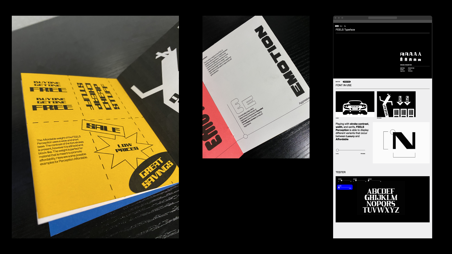
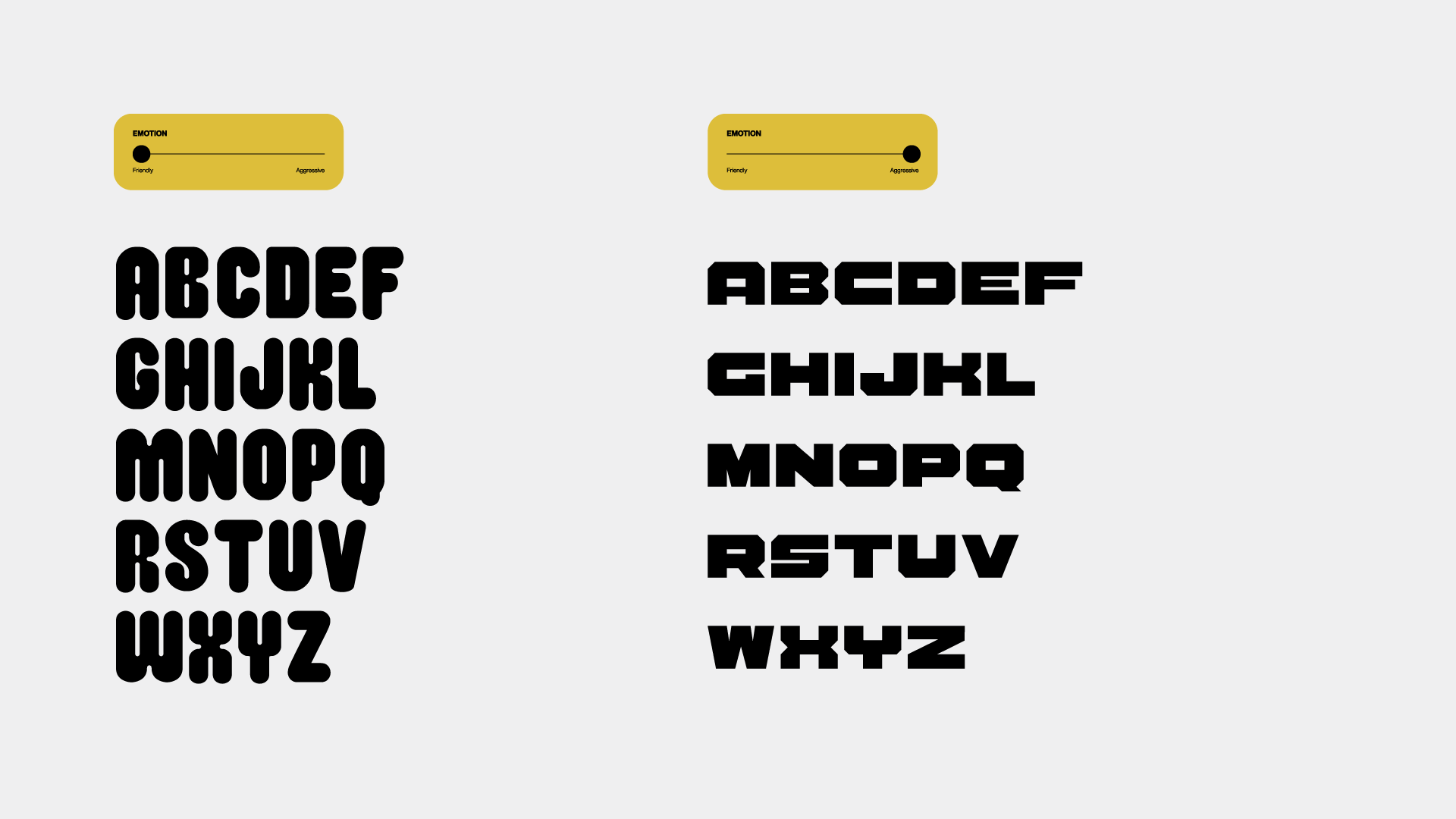
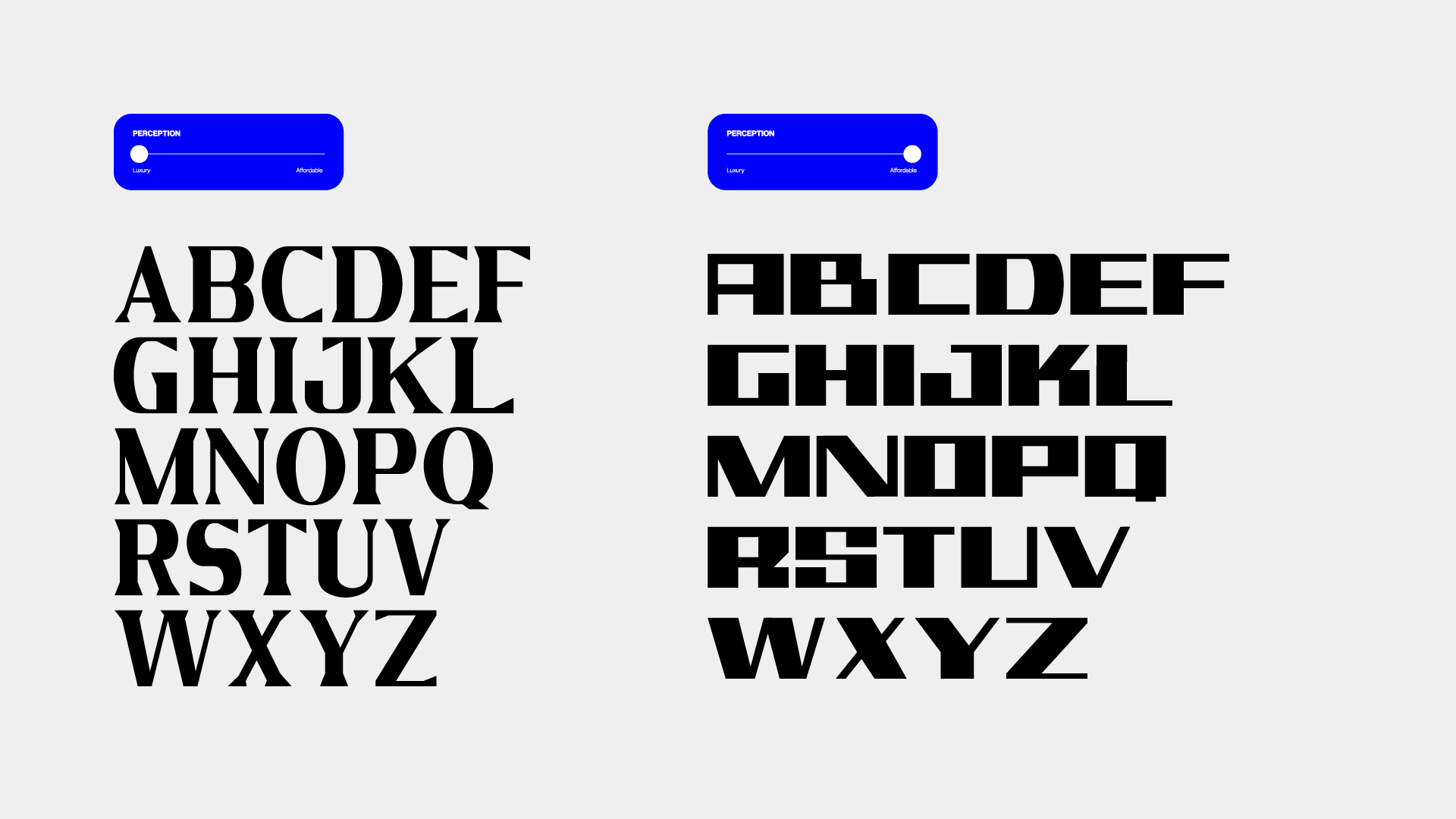
In the end of my thesis process, I managed to deliver an outcome of a variable typeface called FEELS. A variable typeface allows users to use the font’s instances between two different parameters. Most variable typefaces use common parameters such as weight or height to toggle between the instances. For example one end of a variable type can be Extra Bold while the other is Extra Light, and rather than have several weights in between, the type uses only a slider to display those instances. For my deliverable however, I created a font that uses abstracts parameters based off of numerous surveys and studies. That typeface, FEELS, is split into two weights: Emotion and Perception. In the Emotion weight, I used Friendly and Aggressive. The Friendly weight is seen to have rounded corners, a taller build, and a softer overall shape as opposed to the Aggressive side. The Aggressive weight is much wider and has a heavier feel in each letter. As for the Perception weight, I use Luxury and Affordable as two ends of the variable slider. The Luxury side is a serif type that has more consistent stroke contrasts. The Affordable weight is a san serif that looks a bit more odd with its strokes. I then presented the FEELS typeface in two different presentations: a type specimen booklet and a type website. The type specimen is where I displayed its fun possibilities of use. The website prototype shows the type families and examples as well as gives an idea of a type tester.
